Money Manager
2021 / USABILITY STUDY
I conducted a usability study on Money Manager, an expense and budget tracking mobile app with which users can record transactions, track income, view spending trends, and manage accounts.
CONTRIBUTION
User Interviews
Product Evaluation
ROLE
User Researcher
Money management mobile apps have emerged as effective approach to address financial illiteracy in college-age adults.
My team conducted a usability study on Money Manager to evaluate its effectiveness with college-age users.
We established two primary objectives for the study:
Evaluate the effectiveness of the Money Manager as a money management tool.
Identify user motivations for engagement and habits of use.
The Process
Exploratory study to…
Identify money management strategies, barriers, and motivations of college students
User testing to…
Evaluate how/if Money Manager addresses user needs and requirements
Synthesis to…
Analyze testing data to generate usability themes
Produce actionable design recommendations to improve usability and engagement
My primary roles in this project were to design usability testing sessions and conduct thematic analysis on the collected data. I collaborated with two other UX design students on this project.
The app can serve as a helpful aid for both financial experts and novices, however, usability issues have prevented customer uptake and prolonged engagement.
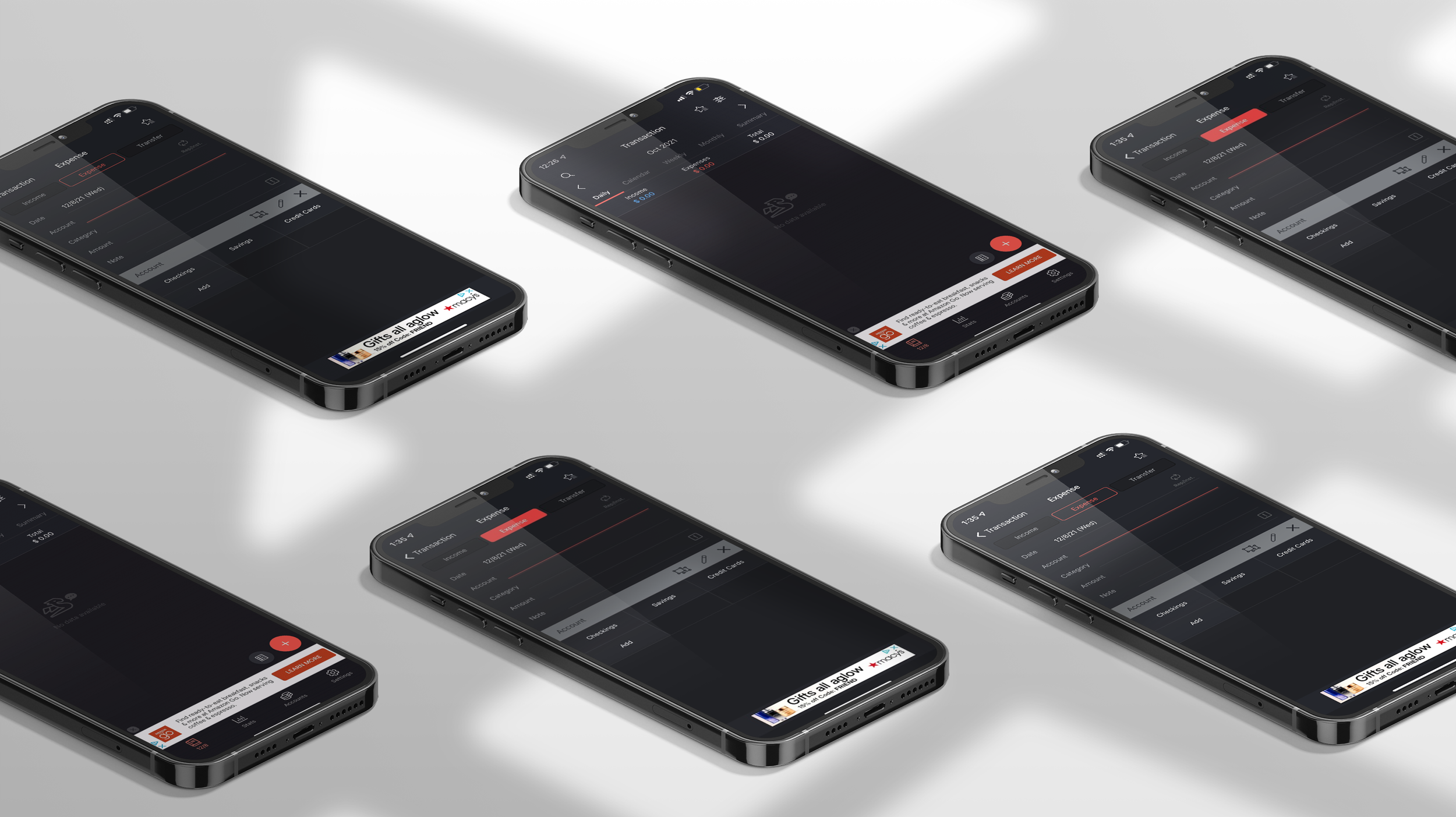
Money Manager is an expense and budget tracking mobile app with which users can record transactions, track income, view spending trends, and manage accounts.
We performed an exploratory study to identify money management strategies, financial literacy barriers, and motivations of college-age users. Results from this study informed our user testing metrics and methods.
Artifact analysis
We conducted a brief artifact analysis to familiarize with the Money Manager interface and features. Money Manager boasts four primary features:
Track income and expenses
Visualize spending trends
Manage financial accounts
Author budget plans
User interviews gave us insight into target users’ current money management strategies, financial confidence, and prior experience with information tracking apps
We conducted five of semi-structured interviews with college freshman and sophomores. College students were selected because they were likely to have recently moved away from home and achieve a level of financial independence. Interview analysis yielded three major themes:
A rough transition towards financial independence. Participants struggled managing income and budgeting for necessities and pleasure.
Low financial confidence. Most participants expressed insecurity when managing their money, with some using spreadsheets and other relying on mental tracking.
Divergent desires and goals of a money management app. All participants agreed that clear presentation of spending data would be imperative for a financial app, but the preferred presentation methods varied significantly.
Scenario-based user testing revealed how Money Manager helped user accomplish real-world financial tasks.
Scenario 1: After a week of frequent shopping and eating out, you've sat down to log your expenses.
Task 1: Log the first expense entry using information in the provided table.
Task 2: Continue filling in expense entries from the provided table. You may stop whenever you like.
Purpose: The first task measures the intuitiveness of the expense entry process and the second measures the number of entries users entered before reaching fatigue.

Scenario 2: You've had your eyes on a pair of boots and they just went on sale, but you’re still not sure you can afford them.
Task 1: Navigate to the expense pie chart
Task 2: Based on the chart, determine whether you would purchase a $50 pair of boots.
Purpose: These tasks measured the efficiency of navigation pathways, the effectiveness of the data visualization, and the chart’s ability to aid in financial decisions.

Scenario 3: After a week of overspending, you've decided to set a weekly budget for yourself.
Task 1: Navigate to the budget settings screen
Task 2: Navigate to the repeat settings screen
Purpose: Both screens are accessible via multiple navigation pathways, so this task aimed to evaluate the intuitiveness of the UI and its navigation.
In addition, we asked follow-up questions after each main task relating to users’ thoughts, feelings, and general impressions while performing the task. For certain tasks, we probed further to understand how useful Money Manager’s features would be to them as newly financially independent young adults. This mix of quantitative and qualitative data allowed us the greatest insight into the usability of the app for college-age users.
Evaluation sessions were conducted remotely on Usertesting.com. Participants were asked to complete the a series tasks and while sharing their phone screen. Tasks were grouped by the primary features of Money Manager, namely expense tracking, data visualizations, and settings. For each task and subtask, we measured the number of taps, scrolls, requests for assistance, and total duration of the task. These values, when compared to optimal navigation paths, provide quantitative data indicative of the efficiency and usability of Money Manager.
Synthesis
After the usability test sessions, transcripts, notes, and recordings were compiled and moved to a Miro board for analysis. Qualitative data underwent thematic analysis while taps counts, scrolls, and error rates were visualized in Excel.
Insufficient onboarding procedures leave users confused with the multitude of available features.
Based on the results of the data analysis, it was clear that the initial interaction with the app is too confusing for users. On average, users tapped 9 more times compared to the optimal navigation path. Guidance was required on all the tasks that required navigation to desired screens. P6 exclaimed, “Oh, it’s getting difficult now,” when trying to find the “Repeat Settings” page. The app does not provide tutorials or explanations for its primary features.
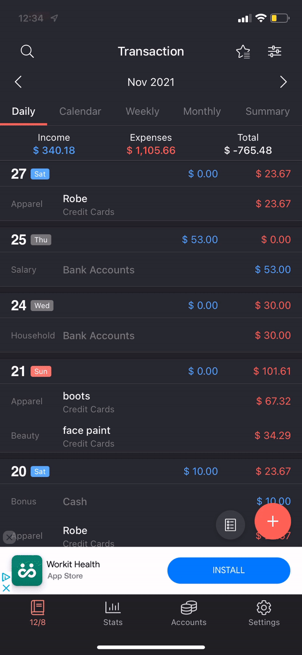
The expense logging process is tedious, particularly when logging multiple expenses in one sitting.
Every participant described the process of logging expenses as tedious, unnecessarily time consuming. P3 stated that “going back and forth between categories… It just felt really tedious.” The results of Task 1.1 bolster these claims, with an average completion time of 103.33 seconds and an average number of taps of 14.33 to log a single expense.
UI design is legible and customizable color schemes are helpful
On a positive note, participants remarked how simple the UI was without distracting elements. The default colors were coded nicely with the Income and Expense buttons and were fairly intuitive. However, during Scenario 1, participants often failed to change the Income/Expense category for each expense, which amounts to a significant error in the budgeting process.
The financial novice would greatly benefit from brief onboarding tutorials to explain primary features. More, a streamlined expense logging process would improve user experiences of all financial literacy levels.
From our research findings, we developed a list of design recommendations to improve the usability of Money Manager for college-age users. Design recommendations map directly to usability session findings and are ranked by feasibility and potential for impact on user experiences.
Provide Guidance for First-Time Users through an initial introduction video, walkthrough tutorials, and descriptive pop-ups when encountering complex screens.
Automate Expense Logging through bank account integration and a frequent item autofill feature.
Refine Content Hierarchy by employing visual hierarchy principles and increasing accessibility of primary app functions.
Conclusions
The Money Manager Expense app boasts a simple, effective graphical interface that exemplifies its utilitarian functionality, yet it still suffers from several usability shortcomings. While insufficient onboarding procedures lead to confusion and expense logging requires high cognitive effort, the interface design and colorful elements succeed in establishing a clear visual hierarchy.
Comprehensive tutorials, automatic expense logging, and the maintenance of proper visual design principles would properly address each of these findings.
Although recommendations were ranked by both feasibility and impact on usability, implementation of any of these solutions will produce positive, measurable effects on the user experience.