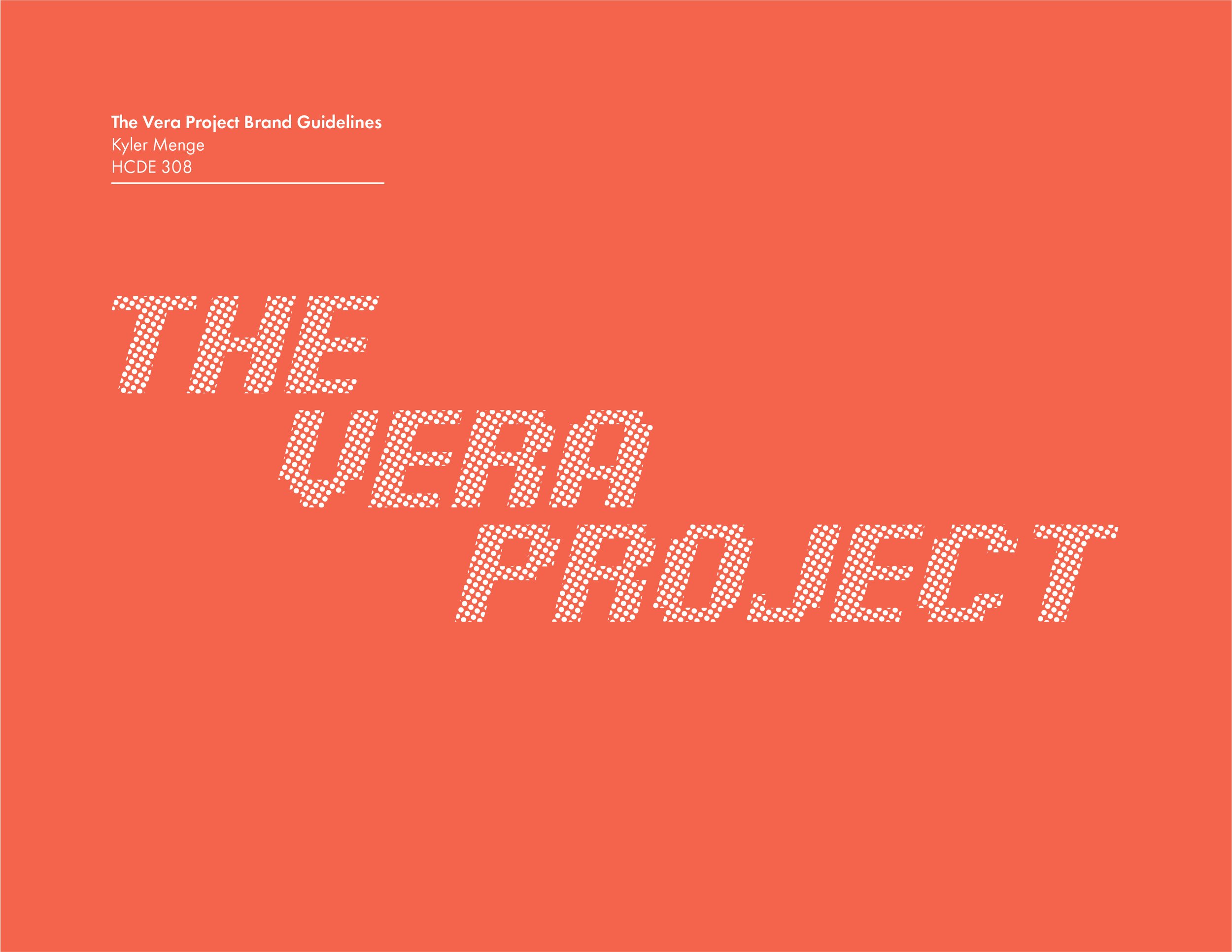
2022 / THE VERA PROJECT / BRAND REDESIGN
As the final project for my design and visual communications course, I redesigned the brand identity for The Vera Project, a Seattle-based nonprofit concert venue and community center.


ROLE
UX Designer
Visual Designer
CONTRIBUTION
Brand research
Graphic design
Wireframing
The Challenge
Redesign the brand identity of The Vera Project to more accurately convey company passions, goals, and values.
The Process
Initial brand identity review
Logo design
Iconography
Wireframes
Color and Typography
Brand Book
Initial brand identity
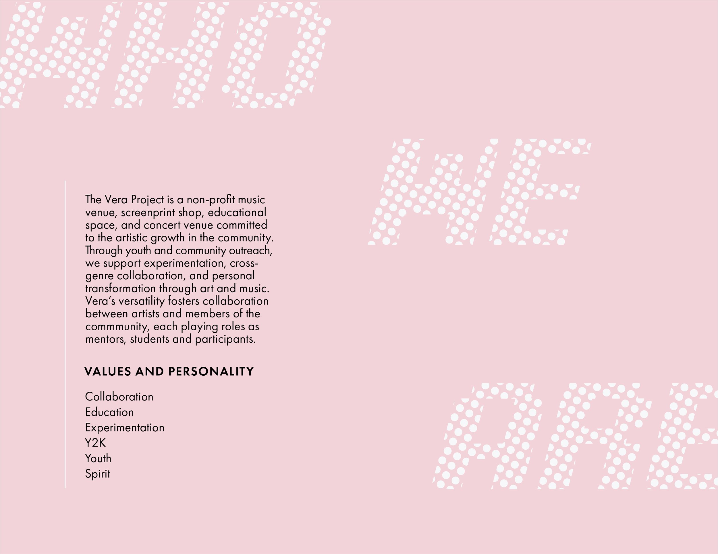
The Vera project emphasizes community and youth involvement in the arts. The website advertises many concerts, classes, and youth programs with individually curated posters. However, magenta, black, and white dominate the pages and generate a much more mature mood than intended. The site features many lists, links, and blocks of texts that detract from the visually interesting posters and student works that dot the page. These features, combined with the dated icons and layout, provide various areas for improvement for The Vera Project to more accurately convey their brand identity.

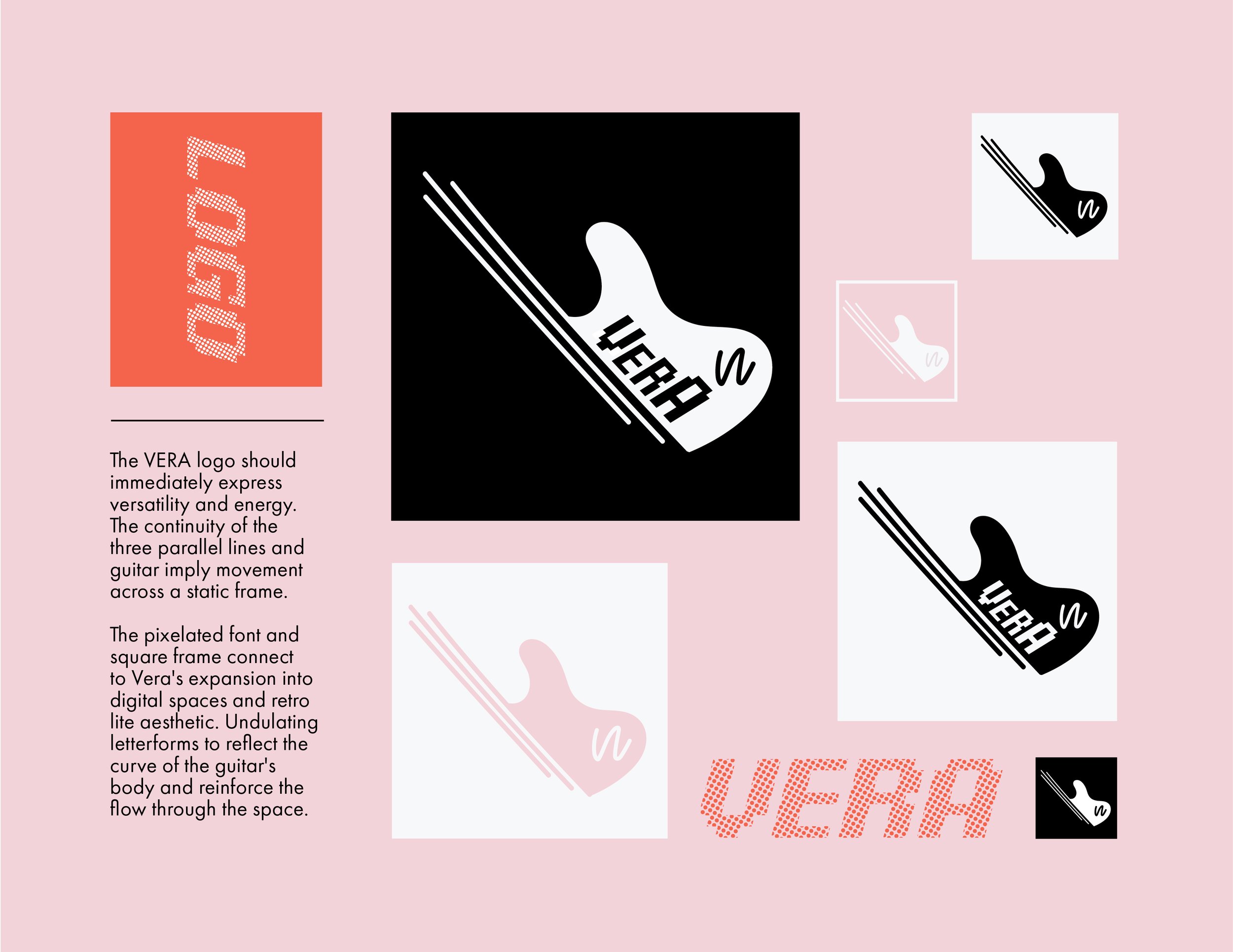
Logo Design
Because Vera lacked a consistent, memorable logo, I started from scratch. I knew it had to embody Vera's commitment to the arts, so my initial sketches with artistic and musical motifs like paint, instruments, and spotlights. I continued to draw from the initial brand research and what The Vera Project would want to represent themselves. Finally, I decided on two main ideas and polished them up.


Iteration
The first refined sketch expanded on the spotlight and paint concepts to create a graphic, splattery circle. The second followed the instrument concept and is a simple guitar motif. I chose a pixelated font for the two because I thought it reflected Vera's youthfulness and movement into digital spaces.
After a peer critique, I decided to move forward with the guitar. I continued experimenting with line weight, type size, framing, and squiggle character until finalized the design. The finished logos embodies The vitality and expressiveness of The Vera Project while staying legible and unique.

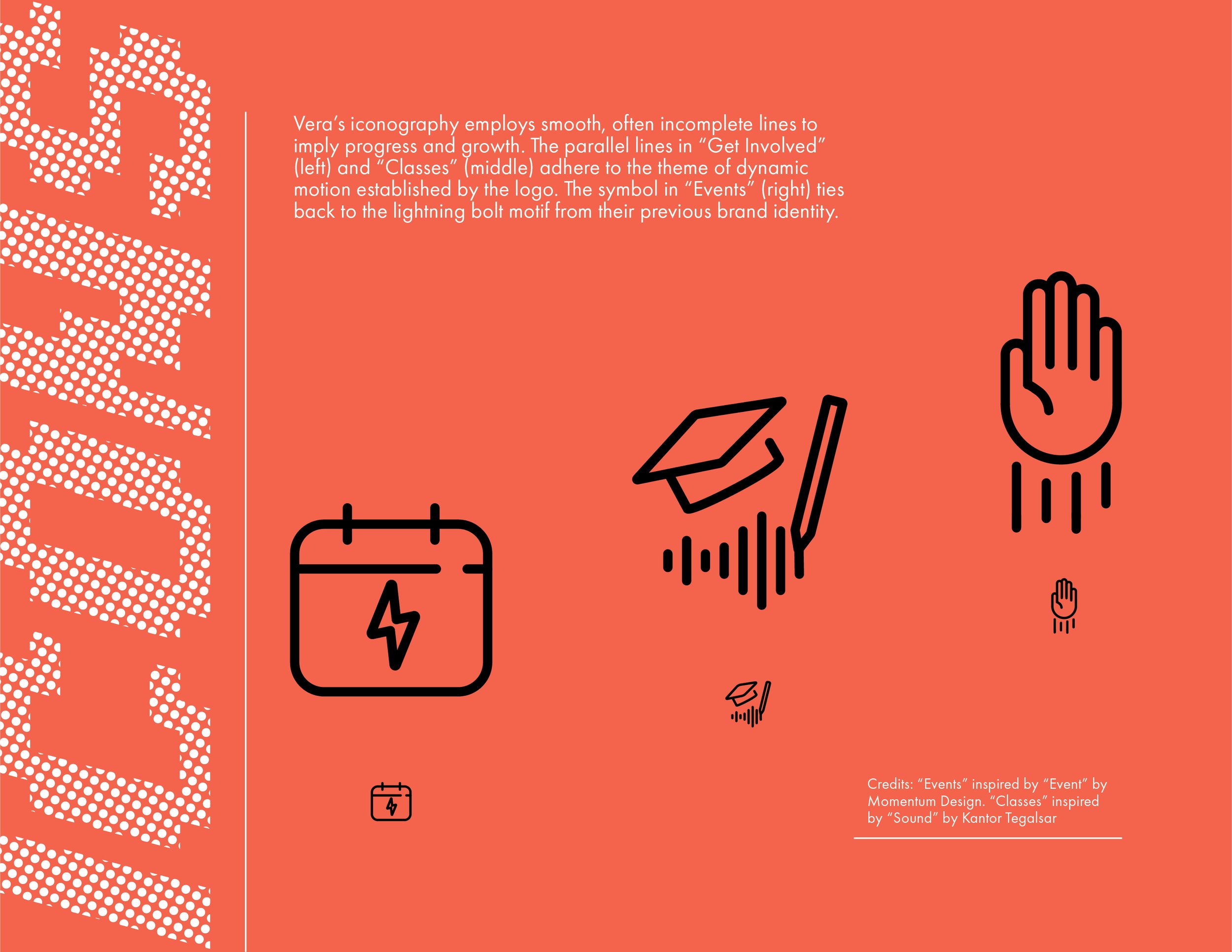
Iconography
I designed icons for the most common user task flows as identified in prior research: volunteering, signing up for classes, and attending events. I continued the style of the logo with parallel, incomplete lines that express movement and energy.
Wireframes
The problems from the desktop site carried over to the mobile site, with lists of links taking the place of menus and navigation bars. To remedy this, I greatly simplified the entire interface by adding intuitive menus and micro interactions. Below are sketches of a user task flow and initial wireframes.
I refined the wireframes into several mobile screens. Like the original site, I wanted to include posters and works by members of Vera and decided to feature them even more prominently. Instead of links that lead to posters and event information, I featured the posters as interactive objects that lead to event information, registration, etc.


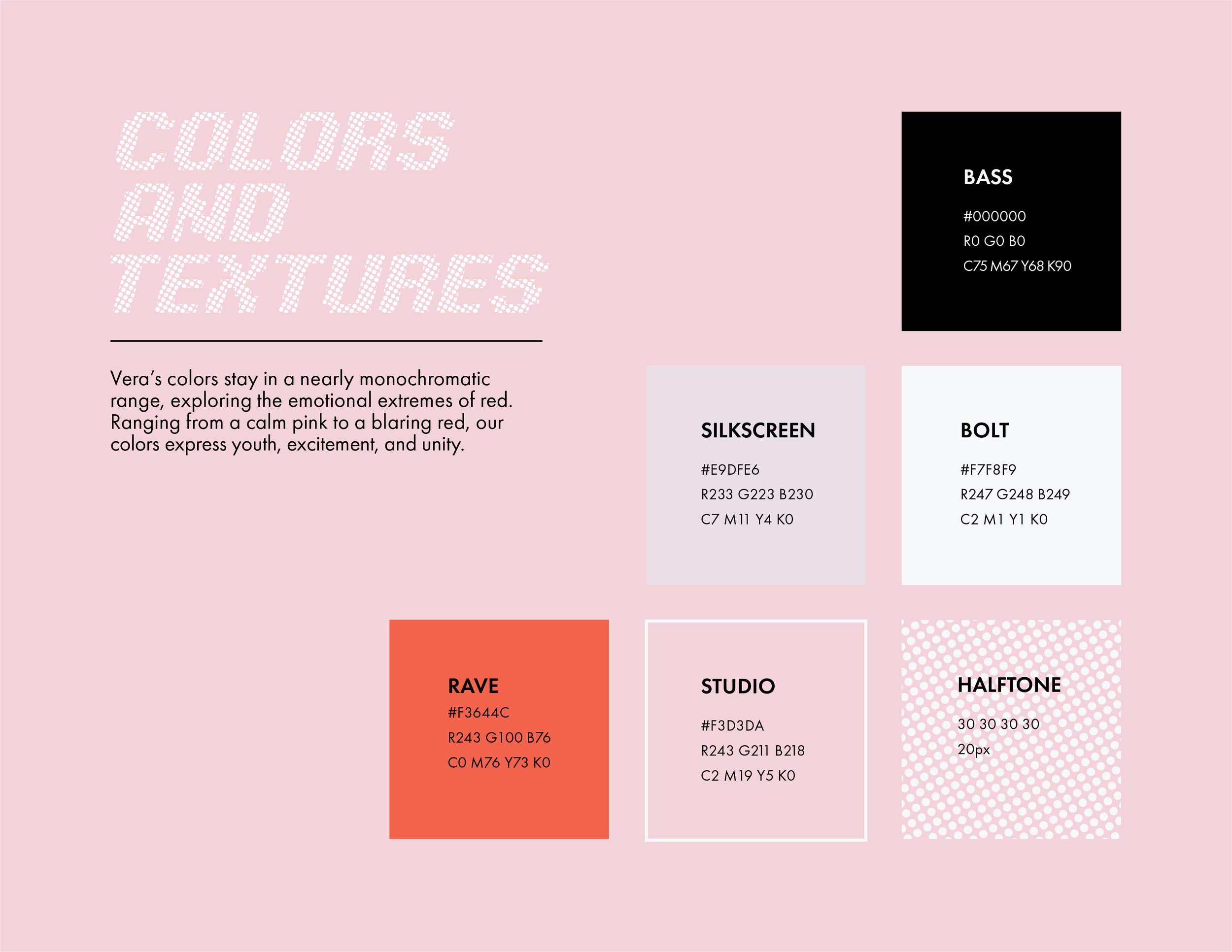
Colors and typography
With the new color palette, I wanted to call back to Vera's original hot pink and black with a palette of red, muted pinks, black, and white (shown in next section). The monochromatic scheme is bold and distinctive enough to stand on its own, but still has moments where it can step back and subtly compliment featured works.
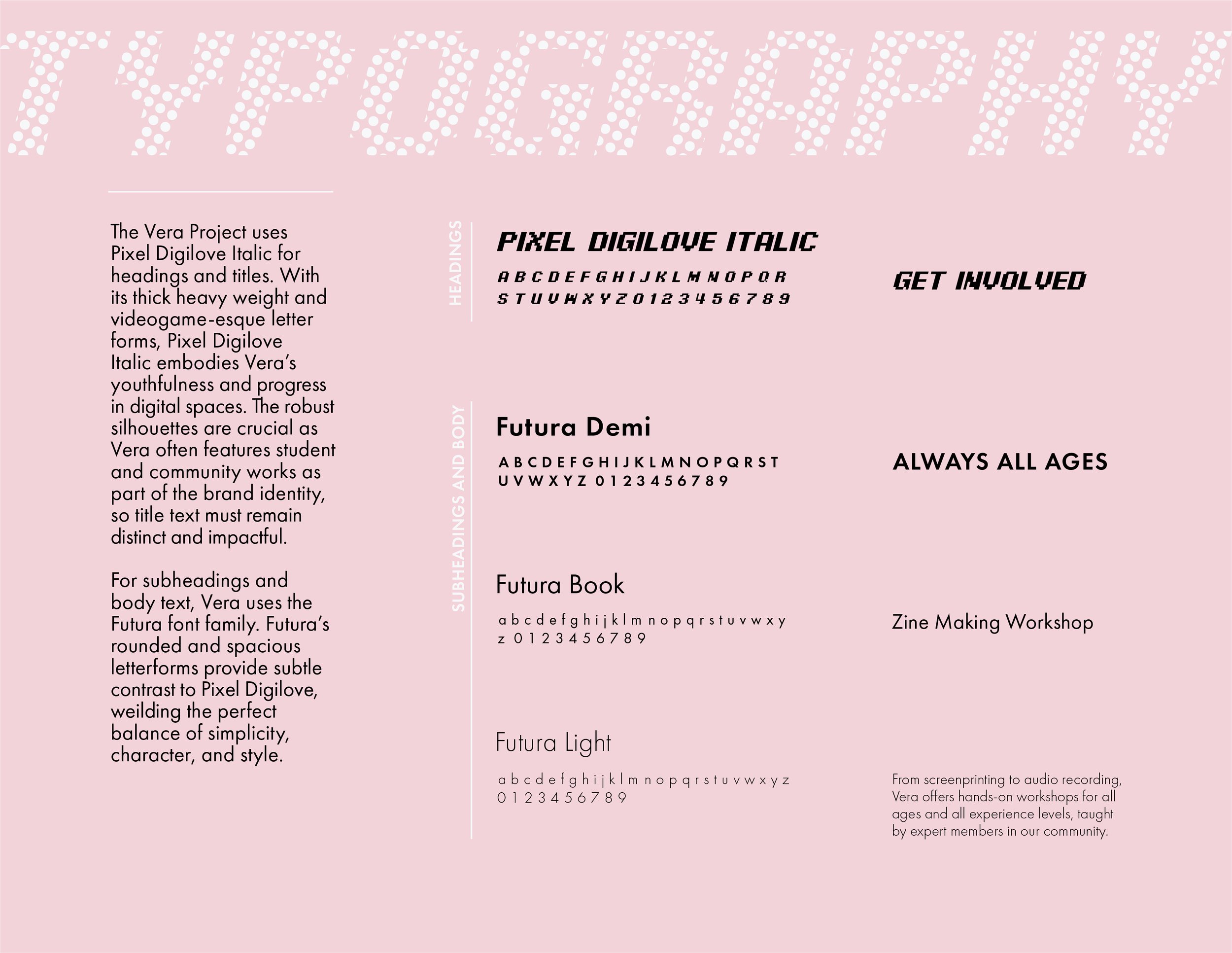
For the typography, I continued the pixelated logo font throughout the interface for large heading and titles. I opted for the Futura typeface for lower headings and body text because of its simplicity and gentle roundness. The pixel font can come across a bit abrasive on its own, so the warmth of Futura serves as a pleasant contrast.
Final brand book
The final brand book compiles all of my previous work, combining the brand research, logo, icons, mobile flow, colors, and typography into a single, clear identity.